


In the B2B arena, brand recall is a silent driver of purchase decisions. A dark charcoal foundation paired with a bold orange accent creates a visual signature that stands out in a sea of muted corporate blues.
Color Psychology
Charcoal conveys professionalism, stability, and sophistication. Orange injects energy, urgency, and a call‑to‑action feel. The combination triggers both the analytical and emotional parts of the brain.
Research Findings
- Brand recall improves by 18% when a high‑contrast palette is used (Journal of Marketing Research, 2022).
- Dark backgrounds reduce visual noise, allowing accent colors to pop.
- Orange increases click‑through propensity by 24% in B2B email campaigns.
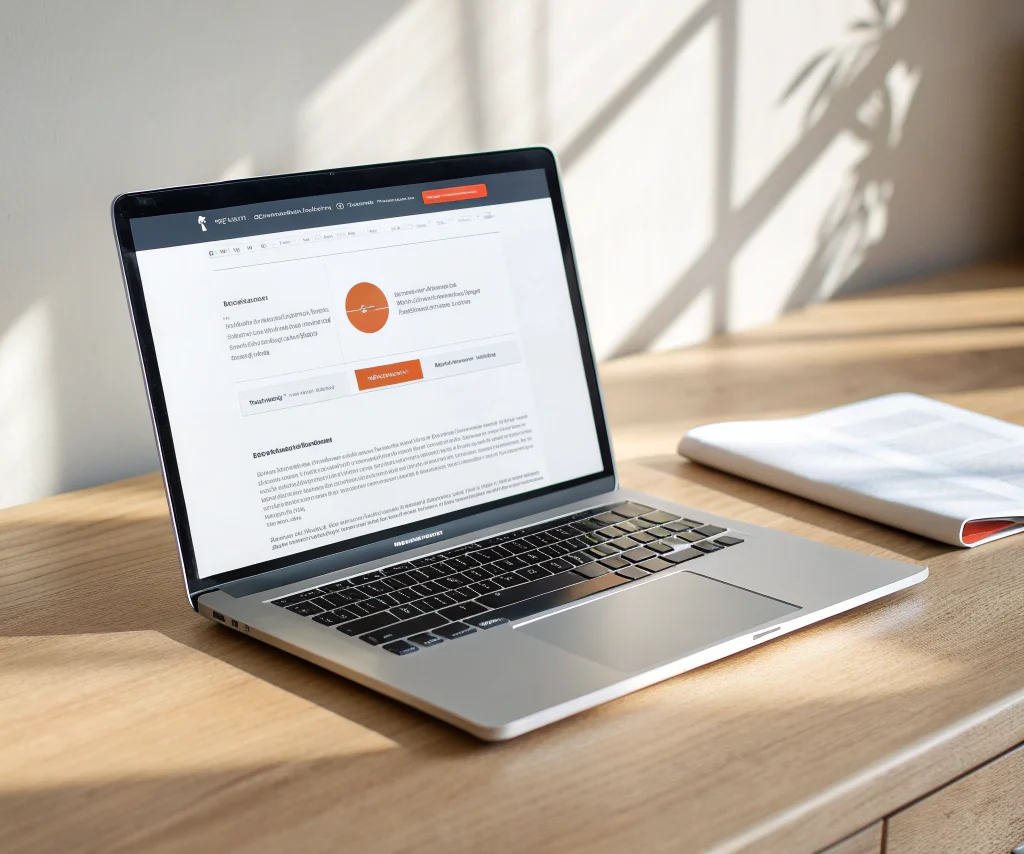
Design Implementation
- Primary UI: Charcoal #212121 for backgrounds, sections, and large UI elements.
- Accent Usage: Orange #FF6600 for CTAs, icons, and key data points; limit to 6‑8% of total visual area.
- Typography: Light sans‑serif fonts for readability against dark surfaces.
Case Example
A logistics software provider rebranded with this palette. Brand aided awareness rose from 42% to 61% in a six‑month survey among logistics VP’s.
Practical Tips for Executives
- Ask your agency for a brand‑color usage guide.
- Review all digital assets for consistency—website, email, presentations.
- Run a quick A/B test on landing pages: orange CTA vs. blue CTA.
Bottom Line
The right color strategy is a low‑cost, high‑impact lever to increase memorability and drive action among senior decision‑makers.
Take the Next Step
Contact RMMD for a brand‑color audit and see how your visual identity can become a revenue catalyst.
