


Depth in web design mimics the real world: closer objects appear larger, farther objects recede. When executed with purpose, it signals sophistication and strategic thinking—qualities C‑suite executives value.
Psychological Impact
Studies from the Visual Cognition Lab show that layered depth improves perceived credibility by 23%.
Design Techniques
- Layered Hero Section: Background video blurred, foreground copy crisp, orange accent lines guiding the eye.
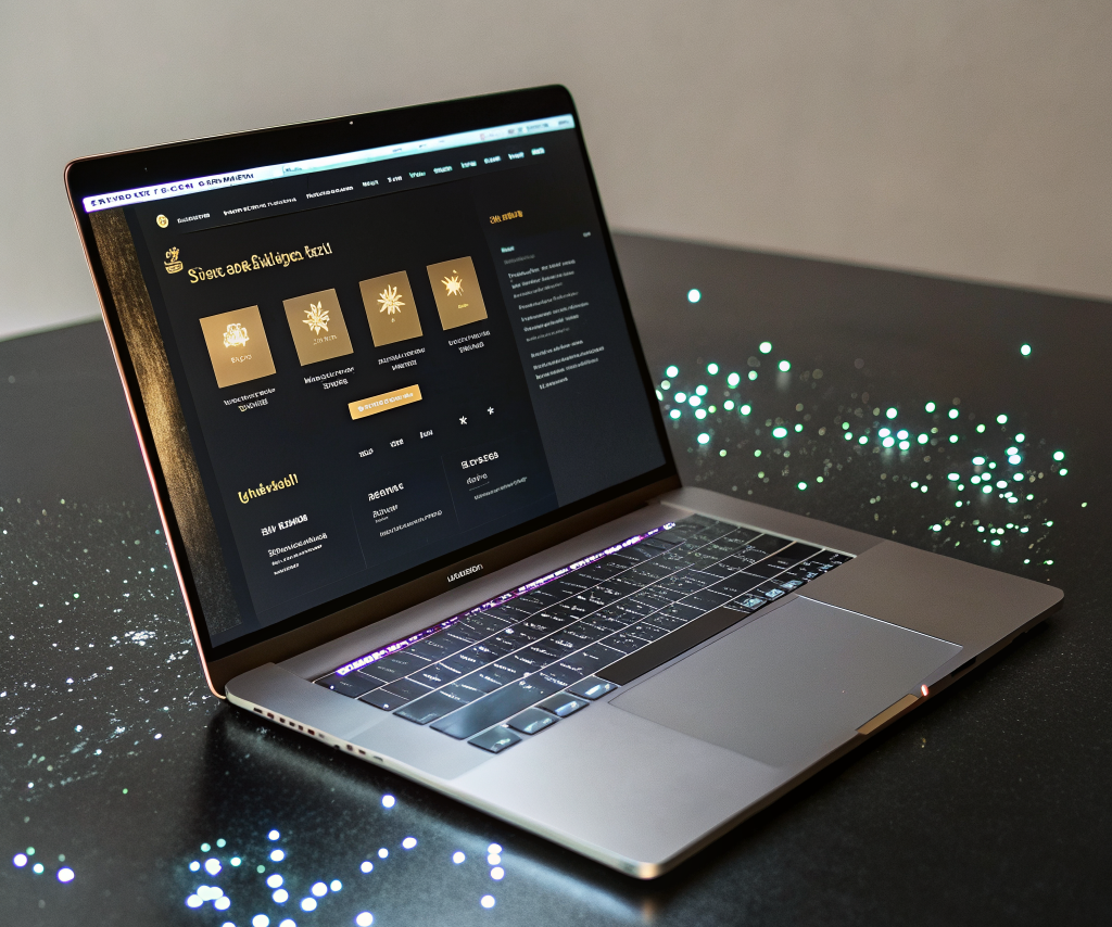
- Shadow Play: Subtle drop‑shadows on cards to separate content tiers.
- Scroll‑Linked Depth: As the user scrolls, foreground elements shift faster than background, creating a sense of forward motion.
Performance Considerations
Use CSS transform: translateZ() and perspective to achieve GPU acceleration. Optimize assets with lazy loading to keep page speed above 90 on Lighthouse.
Real‑World Example
A B2B data analytics firm implemented layered depth on their solutions page. The resulting design increased executive engagement time from 48 seconds to 1 minute 22 seconds, and the lead‑to‑opportunity conversion rose 19%.
Implementation Checklist
- Define primary focal point (usually the CTA).
- Maintain a maximum of two depth layers to avoid visual clutter.
- Use brand orange for the topmost layer to reinforce brand recall.
Executive Summary
Layered depth isn’t a gimmick; it’s a visual language that tells senior leaders you understand complexity and can present it clearly.
Next Steps
Request a depth‑audit for your website and see how a premium visual hierarchy can boost authority.
